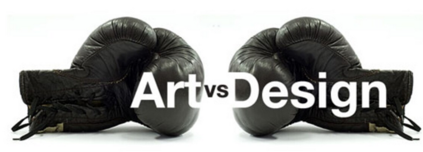
What’s the difference between Art and Design?
Students and beginners often ask me fundamental questions like these: ‘how to tell art and design apart?’
Alright, so let’s get on this ephemeral question, but also start with the disclaimer, that this is a subject of philosophy, one you may agree or disagree with, as these concepts tend to be quite subjective and biased-driven, we all have different ways to view the same world, but hopefully this script is enough to kick-start debate and help you out, as a seeker of meaning and knowledge, and as someone who wants to find out more about design and art.
With the disclaimer nice and easy, kicked out of the way, and reverencing, that this is just my philosophy of how I tell art and design apart, let’s dive in and try to take things off the underworld of ambiguity into a strong handshake between theories and praticality of what design is about.
- Art: Something that makes the world feel a bit less terrifying, something to relate, something to connect, express, and find meaning, even if it’s in the abstract. The contrary of nihilism.
- Design: Something that serves a purpose, an outcome-driven, and arrived at a specific conclusion due to the necessity to find a solution to a need, and it’s manifested throughout in such a way by its visuals. IE: A shark only looks like a shark because it needs to swim fast, not because the rhythmic quality of its silhouette is appealing to the eye of the viewer, that just happens to be a byproduct of how we perceive the need that the shark evolved in itself to solve. Which is, to be a killing machine, and thus, it looks like one.
Great! Wohooo, that was mildly inspiring, I feel as great as I x’d the last Ted Talk that I watched on YouTube.
How can we start applying the theory to practicality? We’ll go over a few case studies next.
The Archetypes:
Remember the shark analogy? There is no difference here. The shark only looks menacing and fierce because it evolved to fulfill its needs this way. It actually doesn’t just look like a threat, it is one. The look and intention go hand in hand together here.
This is a formula to digest and comprehend, until you can see the pattern and apply it to other contexts.
The Gangster Character Design:
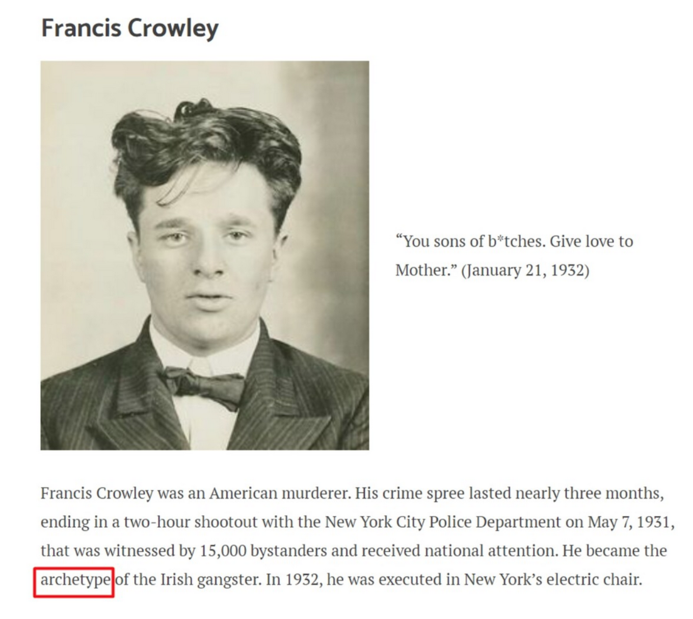
A Gangster is only a Gangster because it evolved to look that way, the archetype of its look was set, and it gave genesis to lend aesthetics to cult-classics like ‘The Godfather’. You don’t need to think too much, align the intention with the look, always.
If you do your job well, people should be able to ‘judge the book by its cover’, on your designs.
A good example of what does it mean to have a good design, and how to be a designer is to do things intuitively, understand them analytically, and execute them fearlessly, the wheel wasn’t shaped by careful meditation, nor was the first spark of fire found by man to light their cave, driven by thinking about analytical processes, and ‘what tool (software) do I use to light this fire?’ it was rather a raw summon for a purpose that needed to be filled within a necessity.
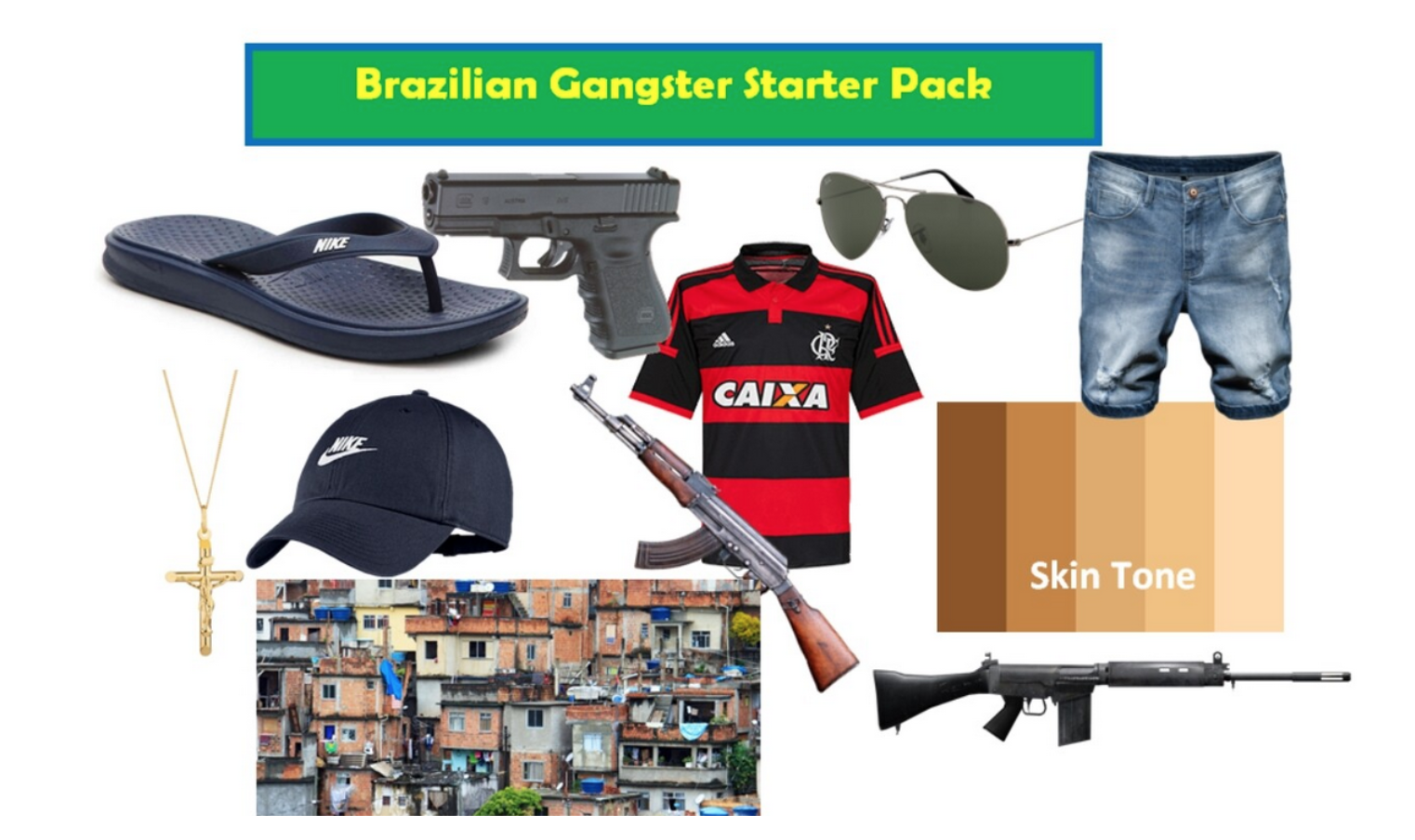
The looks (of this character) are pop culture and it’s where the mind’s eye will gravitate to the most, and recognize the character as a gangster, this is done intuitively, by both the designer and its audience, and things are born out of patterns of repetition because the ’30s were such a prime time for crime, and everyone sported this fashion, it became a motif that was attached to the subculture. Of course, this could have been the wrong answer to a set question, such as, no gangster would look like this in the modern world, as no one sports this fashion anymore.
Image from Reddit’s r/starterpacks
Intuitively, a gangster from the appearance factor is what the audience will perceive as such, depending on the time-period. Analytically, it’s that, on top of what is the most practical gear and clothes to sport, social status will play a role here, and it’s where the background story of a character on a proper client brief will fill in the blanks in a specific and original character design, rather than speaking surface generics, as we are now. Understanding the brief is important to execute things fearlessly and flawlessly, as it’s the only precious document where the necessity to be solved is outlined for us, as designers, to bridge gaps, connect dots, and arrive at a solution.
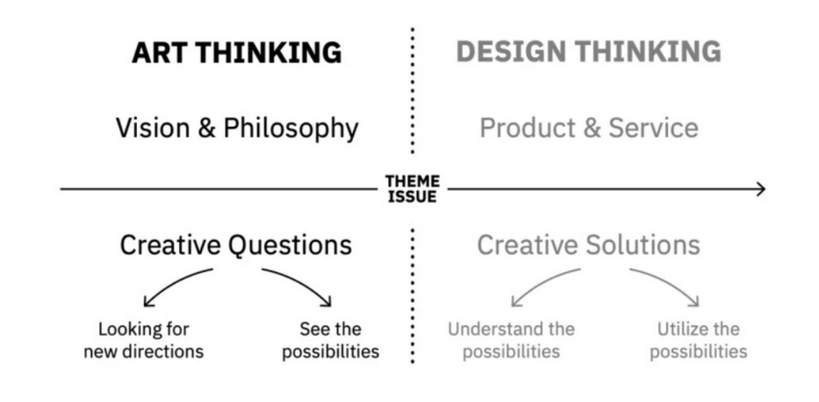
This is a quick analysis of how we can think about it, in a Venn Diagram, it gets a lot more complicated and intricate than this, and you can think and meditate as deep as you’d like, but in essence, a quick sketch:
“We have to start from the user and build backways to the Technology, we can’t start from the Tech and sell the tech only.” — Steve Jobs.
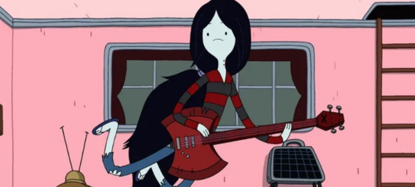
Case study: Marceline from Adventure Time:
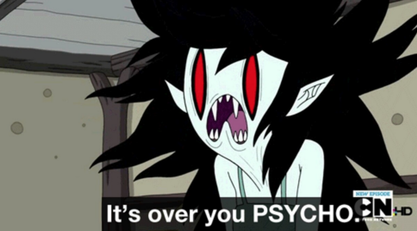
Any character in Adventure Time could fall into this category of a case study to dissect and learn from, but let’s choose Marceline, the Vampire Queen, for the sake of simplicity.
There is a part of a simplification of shapes while keeping the main landmarks of the face, other parts flow and you convey exaggeration of their positions for the sake of the necessity this character is fulfilling in the context. She’s being aggressive to her ex-boyfriend, and she usually woud look like this when not stressed out:
Symptoms of design vs art:
Identifying when things are design oriented or when something needs re-design is when something isn’t intuitive. Whenever something is out of place, you ‘feel’ it, you ‘experience’ it firsthand, things don’t click and flow from process to purpose.
This is design. The organizing, re-wiring, construction of things, and aligning them to serve a purpose or a need better. It’s custom-crafted, empathy driven.
The wheel was never built with aesthetics in mind, otherwise, they’d have added ornaments to it. Unlike Adolf Loos advocates, I don’t think ornament is a crime, there is emotional power in ornaments that can serve design, but he’s right in the money when he defends that ornaments aren’t necessarily needed in architecture, but it’s less true to our field of concept art and entertainment design.
You can feel it in the way you label things when you think everything is disorganized and loses momentum, if the wheel was made with a square shape, you’d be wondering what else could it need to be improved, so the cart moves better.
When you find yourself looking for a specific necessity to be fulfilled, or something looks and feels out of place and space, maybe that was what the masses refer as “bad design”.
Image by Ars Electronica
“For most of us, design is invisible, until it fails” — Bruce Mau
Closing thoughts:
Design is:
Useful, pertinent, relevant, project-driven, iterative, empathy fueled, moved by purpose, goal-oriented;
Making your life easier;
Enlightenment, you don’t need to think about it, you do it effortlessly and as a byproduct of the needs on the table. You don’t question it nor its relevance nor importance, you do it to problem-solve;
Design is demanded but never forced; rises from a need, but from a pre-conceived idea ‘’Nature is the best designer, due to this example here we’re case studying.’.
And lastly, be creative, have fun, push the boundaries between art and design, and never forget to dance!
About the author:
Need a top-tier freelance concept artist and designer? Miguel Nogueira specializes in creating compelling visual solutions for game studios and has been featured in CGSociety Hall of Fame, Behance, Kotaku, and 3DTotal.
Recently, Miguel has worked with several AAA and AA game studios, contributing as a Senior Consultant Concept Artist and Design Lead.
Interested in collaborating? Visit www.menogcreative.com for inquiries.

